


The art of being persistent in an interview
 Something even experienced journalists struggle with is asking a question again when it isn’t answered the first time or asking follow up questions seeking clarification. This is especially true of journalists working in cultures where it is deemed impolite to question those in authority or older people. OnMedia has some tips on how to be persistent and get the answer you, and your viewers, need.
![]() read more
read more


![]()
Journalists – find out how popular your work is
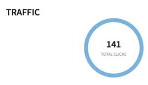 You’re a journalist, and you’ve just posted your latest article, video or radio piece on Facebook, Google+ or Twitter. But how can you track who’s sharing it and how many people you really reach on social media? Whether you just want to learn more about social media analytics tools or start increasing your impact on social media, onMedia will help you get started with the following list.
![]() read more
read more
![]()
Tools and Apps for Journalists: Tableau
![]() If you want a novel way of visualizing masses of complicated data, or you are looking for an alternative to Datawrapper, then Tableau Public could be your choice for creating state-of-the-art interactive graphs, charts and maps.
If you want a novel way of visualizing masses of complicated data, or you are looking for an alternative to Datawrapper, then Tableau Public could be your choice for creating state-of-the-art interactive graphs, charts and maps.
“We used Tableau because we had no programmer” says @PauGuisado at #dhplus .This sentence is becoming a #ddj mantra.
— daniele grasso (@danielegrasso) May 9, 2014
What is Tableau?
Tableau Public is free software which allows you to visualize data in many ways and create all kinds of maps, charts and graphs (and there are pay versions of Tableau too). A great function of Tableau is the ability to put multiple data sets together into a so-called “Dashboard”, which among other things, allows the filtering of results. This is one of the software’s strengths because it lets you analyze the data in more detail. For example, in the visualization I produced below of net energy imports, you can click on a particular year and a particular region to see how energy use is changing.
How can journalists use Tableau?
Unlike several other web-based services, you need to download and install the software onto your computer (only available for Windows). You then open up your data and drag and drop to create different types of charts or maps. Then you can upload the results publicly to the web. You can then embed the visualizations in your own website or easily share it via social media.
Is Tableau easy to learn?
In short, yes. But I recommend that you first take a look at this helpful introductory video:
By following the steps in the video, it should be quite straightforward to start creating basic visualizations. But if you want to do more complicated work, you’ll probably have to take some additional time to play around and explore all the software’s features. It took me a few hours to create the visualization shown above, but this also included time spent cleaning up and arranging the World Bank data in Excel (if you would like to have a go at doing this on your own, look at my spreadsheet on Google Drive).
Advantages
Apart from the introductory video above, many other great tutorial videos are available. Some data journalists advise you to visualize your data in as many ways as possible so you don’t miss any patterns. This is simple with Tableau – once you have uploaded your data, it suggests appropriate visualizations methods. The filters are easy to add and you can configure them so that they are interactive. Everything is highly customizable: you can change colors, alter fonts and adjust text sizes just as needed. All this is done offline. Once you’ve installed Tableau you can start working on your computer. The internet is only required when you save your project to the web.
Disadvantages
Tableau is however not as intuitively hands-on as Datawrapper. I tried to start using Tableau straight after installing the program, but quickly realized that I’ll have to watch some how-to-videos. Another con is that once you’ve uploaded your data set, you cannot refine it within the program. You would have to change it within the spreadsheet itself and then upload it again. Though it is great to have many ways to customize your visualization, it is not always that easy to do. I found it time consuming to set the right color steps for my map or to choose the boundaries of the scale within a sheet, for example. Another annoyance was that sometimes when I dragged and dropped elements to the Dashboard, they didn’t drop where I wanted them to and I had to spend time reorganizing the elements. It means you better sit back for a moment to think of what you want your final structure to look like to avoid frustration (get some tips on this here).
Upshot
All these cons would not keep me from using Tableau. It is an interesting tool with a great variety of options. For simple graphics I would still use the Datawrapper. But for more sophisticated visualizations, I would go for Tableau – simply because then you can explore your data in more ways and put all your graphics together neatly in order to tell a multifaceted story.
For some more examples of what Tableau Public can do, take a look here.
Written by guest author, Gianna Grün.
 Gianna Grün is a science journalist with a penchant for data. She works for Global Ideas, Deutsche Welle’s multimedia magazine on biodiversity and climate protection. She also has her own blog, where – among other things – she writes about what’s going on in the data world and takes data tools for a test drive (in English and in German). And in case you prefer to read German, here’s her German post on Tableau.
![]()
Keeping it legal: Images licensed through Creative Commons
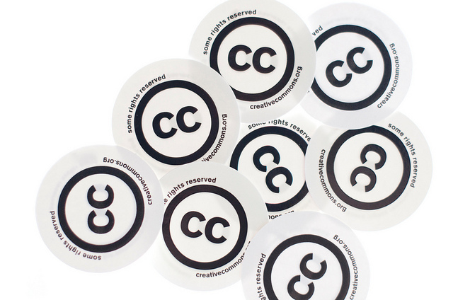
Let’s say you’ve got a blog or a news website and you want a free image for your article or post. You could just go to Google Images and copy the first one you see but you could well be infringing on someone’s copyright. This isn’t just unfair to the photographer or graphic designer, it could also end up being expensive for you if they demand damages. A legal alternative is to look for images with a Creative Commons (CC) license, which allows you to use the pictures under certain conditions. onMedia’s Kyle James, who’s a CC fan, goes into the details.
![]() read more
read more
![]()
How journalists can edit their own work

Photo: flickr/Nic McPhee
These days, journalists have fewer editors looking over their work. Some media outlets have almost done away with copy editors all together. That means it’s more important than ever for journalists to learn how to self-edit, and turn in clean, accurate copy. onMedia’s Kyle James has some tips on finding your inner editor.
![]() read more
read more
![]()
Reporting on climate change: Part II

Good reporting on climate change is important, and likely to become more so in the future as the impacts of changing weather patterns on lives and economies grow. But climate change journalism can be challenging. It’s complicated, controversial and there is a lot of information, and misinformation, to wade through. In part I of this two-part series, Kyle James offered tips on how to report on a changing climate. In this post, he looks some common pitfalls to avoid.
![]() read more
read more
![]()
Tools and Apps for Journalists: Steller
![]() What is Steller?
What is Steller?
Steller is a free storytelling app developed by Mombo Labs. It allows you to create multimedia stories directly on your iPhone or iPod touch by adding photos, videos and text. After several months in beta, Steller was made available in March on Apple’s App Store.
The number of people using the web on their mobile devices is ever growing. Moreover, newsrooms are realizing that not only do they have to be digital first, but they also have to produce content that can be consumed on a small screen. It’s interesting to see how apps such as Steller are focused on producing multimedia stories optimized to be consumed on mobile devices only.
![]() read more
read more
![]()
How to spell check in different languages
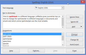
As an editor, I am surprised at how often reporters send me articles that they obviously haven’t run through a spell checker beforehand. And it’s usually journalists who work in a language other than English who fail to spell check – even though they might need all the English spelling help they can get.
With so many free tools and dictionaries available online, there is really no excuse. A reporter’s job is all about getting the facts correct. And if you send off an article, script or even an email full of spelling mistakes to your editor, how can they trust you to get the other facts right?
onMedia offers some tips on how to change the spell checker to different languages in documents and emails and which online spell-checkers are the most reliable.
![]() read more
read more
![]()
Journalists need to get better at spelling names
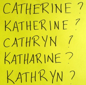 Journalists (and experienced ones at that) often misspell people’s names. This doesn’t just make reporters look sloppy, it also raises doubts about the accuracy of the other information in the report. In the first of two posts about spelling, onMedia’s Kate Hairsine gives some tips on how journalists can spell people’s names right.
![]() read more
read more
![]()
Tools & Apps for Journalists: Meograph
What is Meograph?
 Meograph is a web-based multimedia tool that makes it simple to put together different elements such as video, photos, audio, narration, music, text and links to tell a story. What is especially nice about this tool is the ability to plot the changing location of events on Google maps and to also pin events to a timeline. The final product has similar dimensions to a YouTube video and also comes with a play, pause and stop button. Meograph embeds easily in websites or social media making it easy to share.
![]() read more
read more
![]()


