


Using graphics in your video, and using them well
Photo: flickr/gywst
Infographics can enhance a visual story’s appeal and are extremely helpful in presenting complex information in an easy-to-understand way. Now, it’s easier than ever to use graphics in your videos thanks to more advanced and user-friendly software. OnMedia’s Kyle James takes a look at how a production team from Indonesia used graphics effectively in their award winning video feature.
Journalist and editor Andi Muhyiddin had an important story to tell, one that suited itself well to his medium, television. He wanted to tell the story of Indonesia’s Citarum River, once a gently flowing waterway west of Jakarta, now considered by environmental groups as one of the most polluted places in the world.
Citarum is now a chemical dumping ground for area textile mills and a rubbish bin for many of the five million people who live in the river basin, although some of them depend on the river for their water supply.
Muhyiddin knew he could get powerful visuals as small boats glide through what seems to be a landscape of trash. But he also needed to present statistics on the severe pollution—how much waste goes into the river, what kind it is, what effects is it having on the waterway itself and the region’s environment. As those familiar with TV know, the medium isn’t naturally suited to presentations of a complicated numbers. It often needs a little help, and that’s where the infographics came in.
You can watch Muhyiddin’s video below, which was a finalist entry at the 2013 German Media Development Awards.
Clarity and variety
Muhyiddin had specific goals in mind as he was thinking out how to structure his 10-minute package and use graphics.
Andi Muhyiddin
“All stories on television should be easy for the audience to understand, which is why we need graphics,” he said in an e-mail interview from Jakarta, where he is an executive producer at Berita Satu TV. “[Graphics] help the audience understand the message when the existing video is not enough. Also, they make the package more attractive and add variety.”
And given the short attention spans of today’s audiences, good graphics are a good way to keep your audience from reaching for the remote.
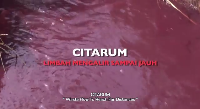 If you watch the Citarum video (and I would highly recommend doing so; it’s well worth the ten-minute time investment), you’ll see that Muhyiddin starts off with overhead black-and-white shots of the river and surroundings, accompanied by fairly dramatic music. He then presents a few statistics in simple, clear text: it’s the most contaminated river in the world, 400 tons per day of cattle waste goes into it and 25,000 tons of domestic waste. The text appears almost as if it’s being typed out, as if on an old Teletype machine. But there’s nothing old fashioned here.
Sometimes all the words in a short sentence fade but one, which then moves to a different position on the screen and is incorporated into a new sentence and new statistic. At one point, a title changes from white to almost blood red. The presentation is dynamic, keeping the audience interested while getting across the newsworthiness and seriousness of the issue.
“Like video, graphics should tell the message effectively,” he said, and dynamic ones are more attractive to the viewer than static words on the screen.
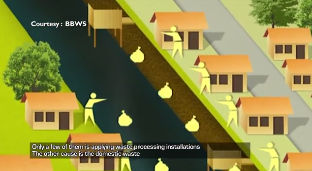 Towards the end of the feature, Muhyiddin used pictorial graphics (starting at 8’42”) to depict deforestation, soil erosion and sediment build-up, ground-water depletion and the waste from cattle, factories and households that regularly enters the river.
Moreover, in areas where literacy rates are lower, these kinds of non-textual visuals that present data clearly ensure your audience is really getting the story.
According to Muhyiddin, it’s best if a producer works with someone with strong experience in graphic design or art, such as Dimas Noegroho, the “best graphics artist in my office,” he added.
For Noegroho, putting together a good package involves good pre-production, including getting the designers on board in the early stages. How information should be presented graphically should be figured out during the scripting and storyboarding process, he said. It’s shouldn’t just be an afterthought.
The tools
Noegroho himself uses Adobe products such as Illustrator, Photoshop and After Effects in his work. For 3D modeling, he uses Cinema 4D Studio, 3ds Max and Viz Artist.
These software packages aren’t free, and they’re pretty complicated, requiring a good deal of training, he said. But for simpler graphics, especially static images, there are many websites that offer data visualization and infographics tools for free. Noegroho recommends visual.ly, which has partnered with big names like Showtime and Al Jazeera.
![]() Other free options include Blender, free and open-source software for 3D animations. Gimp is a free program similar to Photoshop and Inkscape is the free counterpart to Illustrator. Check out this list of some of the best free graphic design software out there today.
Other free options include Blender, free and open-source software for 3D animations. Gimp is a free program similar to Photoshop and Inkscape is the free counterpart to Illustrator. Check out this list of some of the best free graphic design software out there today.
For a video project similar in scope to the Citarum project, Noegroho said if everything were planned out in advance, he would need about three weeks to a month to get the graphics in place.
“Basically, we’re delivering data, but not just giving numbers,” said Noegroho. “The infographics explain the whole chronology of the problem step-by-step and how it came about.” That way, he added, people get the data in easy-to-digest bites which build up to present the bigger picture at the end.
Research done at Indiana University in the US found that animated graphics offer a way to keep viewers watching and to help them remember stories better. But the study cautioned about text graphics used alone. It found that while text can help viewers remember information in difficult stories, it often doesn’t hold viewers’ attention.
So Muhyiddin’s own solution, adding movement to the text, appears to have been a good solution.
Author: Kyle James


![]()