


Search Results for Tag: toolbox
Tools and Apps for Journalists: Tableau
![]() If you want a novel way of visualizing masses of complicated data, or you are looking for an alternative to Datawrapper, then Tableau Public could be your choice for creating state-of-the-art interactive graphs, charts and maps.
If you want a novel way of visualizing masses of complicated data, or you are looking for an alternative to Datawrapper, then Tableau Public could be your choice for creating state-of-the-art interactive graphs, charts and maps.
“We used Tableau because we had no programmer” says @PauGuisado at #dhplus .This sentence is becoming a #ddj mantra.
— daniele grasso (@danielegrasso) May 9, 2014
What is Tableau?
Tableau Public is free software which allows you to visualize data in many ways and create all kinds of maps, charts and graphs (and there are pay versions of Tableau too). A great function of Tableau is the ability to put multiple data sets together into a so-called “Dashboard”, which among other things, allows the filtering of results. This is one of the software’s strengths because it lets you analyze the data in more detail. For example, in the visualization I produced below of net energy imports, you can click on a particular year and a particular region to see how energy use is changing.
How can journalists use Tableau?
Unlike several other web-based services, you need to download and install the software onto your computer (only available for Windows). You then open up your data and drag and drop to create different types of charts or maps. Then you can upload the results publicly to the web. You can then embed the visualizations in your own website or easily share it via social media.
Is Tableau easy to learn?
In short, yes. But I recommend that you first take a look at this helpful introductory video:
By following the steps in the video, it should be quite straightforward to start creating basic visualizations. But if you want to do more complicated work, you’ll probably have to take some additional time to play around and explore all the software’s features. It took me a few hours to create the visualization shown above, but this also included time spent cleaning up and arranging the World Bank data in Excel (if you would like to have a go at doing this on your own, look at my spreadsheet on Google Drive).
Advantages
Apart from the introductory video above, many other great tutorial videos are available. Some data journalists advise you to visualize your data in as many ways as possible so you don’t miss any patterns. This is simple with Tableau – once you have uploaded your data, it suggests appropriate visualizations methods. The filters are easy to add and you can configure them so that they are interactive. Everything is highly customizable: you can change colors, alter fonts and adjust text sizes just as needed. All this is done offline. Once you’ve installed Tableau you can start working on your computer. The internet is only required when you save your project to the web.
Disadvantages
Tableau is however not as intuitively hands-on as Datawrapper. I tried to start using Tableau straight after installing the program, but quickly realized that I’ll have to watch some how-to-videos. Another con is that once you’ve uploaded your data set, you cannot refine it within the program. You would have to change it within the spreadsheet itself and then upload it again. Though it is great to have many ways to customize your visualization, it is not always that easy to do. I found it time consuming to set the right color steps for my map or to choose the boundaries of the scale within a sheet, for example. Another annoyance was that sometimes when I dragged and dropped elements to the Dashboard, they didn’t drop where I wanted them to and I had to spend time reorganizing the elements. It means you better sit back for a moment to think of what you want your final structure to look like to avoid frustration (get some tips on this here).
Upshot
All these cons would not keep me from using Tableau. It is an interesting tool with a great variety of options. For simple graphics I would still use the Datawrapper. But for more sophisticated visualizations, I would go for Tableau – simply because then you can explore your data in more ways and put all your graphics together neatly in order to tell a multifaceted story.
For some more examples of what Tableau Public can do, take a look here.
Written by guest author, Gianna Grün.
 Gianna Grün is a science journalist with a penchant for data. She works for Global Ideas, Deutsche Welle’s multimedia magazine on biodiversity and climate protection. She also has her own blog, where – among other things – she writes about what’s going on in the data world and takes data tools for a test drive (in English and in German). And in case you prefer to read German, here’s her German post on Tableau.


![]()
Using an “axis of importance” diagram to evaluate sources
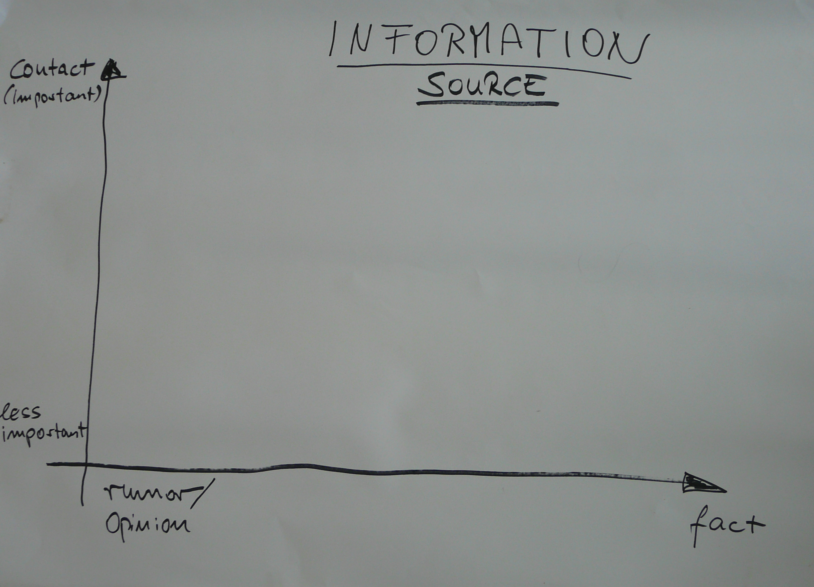 Out of one workshop at NUOL came a good tool that fits perfectly into that quest. It’s a diagram that helps journalists evaluate their sources (see photo at left, click to enlarge).
![]() read more
read more
![]()
10 radio journalism and audio training resources
When it comes to professional radio journalism and audio production training, it's hard to beat having the opportunity to attend workshops conducted by experts. But if you have access to the net, learning new skills or brushing up on the basics via online tutorials and web resources could be the next best thing.
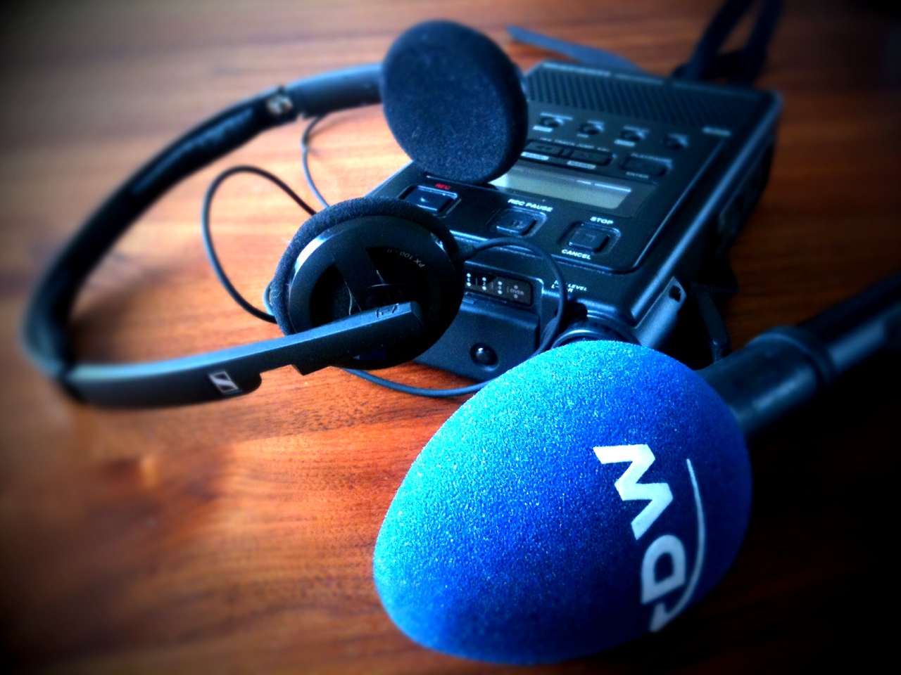
Whether you're a working journalist, trainer or j-student, here is a selection of resources useful for radio journalism and producing audio materials.
![]() read more
read more
![]()
Educators embark into a new era of journalism in Laos
 Is there a proper definition of journalism in the Lao language? Since DW-AKADEMIE’s first workshop on journalism at the National University of Laos in Vientiane, there is. It was conceived by 15 staff teachers of the Department of Mass Communication at the Faculty of Letters – after long discussions revolving around somewhat abstract terms like “media”, “the public”, “society” and “information”.
Lao is not a language that lends itself to describing abstract ideas. Yet the 15 teachers feel it was worth the effort to lay a foundation they now can build upon. They are learning the mindset, tools and skills that in combination make a journalist. The reasoning behind this is that they are the ones training a new generation of Lao students who are eager to take on the profession.
![]() read more
read more
![]()
The best of multimedia formats
 The Web offers infinite possibilities. But not all of them are practical, necessary or recommendable. There are three basic rules that apply to multimedia productions: Less is more; it’s the story that counts; and the concept is more important than effects. This presentation shows you some multimedia formats that are worth a closer look.
![]() read more
read more
![]()
Feedback