


Photography tips for radio journalists
 As a radio journalist you’re supposed to produce a story for the ears but your editor may also want you to produce an online version – a story for the eyes.
It’s a common scenario in newsrooms around the world as broadcast and online newsrooms merge. It means you need to quickly learn new visual storytelling skills in order to adapt your stories for online publication.
While you can find loads of online training resources to help you get started, basic camera skills are only going to take you so far. If you’re required to produce photographs that document the story you’re covering, say an editor is suggesting to bring back eight photographs for a story or picture gallery, then you also need to employ skills from photojournalism.
OnMedia’s Guy Degen offers some tips for radio journalists to help produce strong images for their stories.
![]() read more
read more


![]()
Upgrade your camera with a WiFi memory card
 My smartphone has a fantastic camera and it’s a like a digital notebook for documenting events and sharing content, especially photos. But when I want to produce a better quality image, say a portrait of an interview partner, or when I want to work in low light conditions, then I’ll reach for my digital stills camera.
The question is: how do I make my SLR camera as “mobile” as my smartphone so I can transfer images quickly from the camera to another device and share them on the web?
Yes, I can use a USB cable to connect my camera to either my laptop or my iPad or take out the SD card and plug it directly into the computer. But another way is to use a WiFi enabled SD memory card and there are some interesting advantages of using these cards for covering events.
WiFi enabled SD cards have been around for a while now. The WiFi chip inside the card creates its own wireless network, which allows you to connect your camera via the SD card to another device.
In this post I’m going to refer to two Class 10 WiFi SD cards: the Eye-Fi mobi and the Toshiba FlashAir.
![]() read more
read more
![]()
Think before you map: Learning from Egypt’s HarassMap
![]() In 2008, Ushahidi first mapped post-election violence in Kenya using information sent in by people via sms or online. Since then, thousands of organizations have used Ushahidi or other mapping tools to crowdsource information and present it on a map. The uses have been myriad, from mapping the crisis in Haiti after the 2010 earthquake to getting feeback about dangerous bike paths in Berlin.
In 2008, Ushahidi first mapped post-election violence in Kenya using information sent in by people via sms or online. Since then, thousands of organizations have used Ushahidi or other mapping tools to crowdsource information and present it on a map. The uses have been myriad, from mapping the crisis in Haiti after the 2010 earthquake to getting feeback about dangerous bike paths in Berlin.
After all, crowdsourced maps are often an easy way to put visuals on a web page and show what’s happening in places that reporters or rights activists can’t or don’t get to. But this doesn’t mean media organizations or advocacy groups can slap together an online map and people will automatically start sending reports. Many crowdsourced reporting projects are unfortunately short lived, attracting few reports and having little impact.
HarassMap has won several awards for mapping incidents of sexual harassment in Egypt. onMedia takes a look at what the organization has learned since it launched in 2010.
![]() read more
read more
![]()
Innovative journalism and advocacy projects
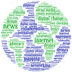 The rapid rise of mobile phones, the Internet and above all, social media is making it easy for even small media organizations and advocacy groups to create journalism networks or develop innovative digital projects that have an impact. From documenting the disappearance of trees in the Amazon rainforest to giving a voice to the illiterate in India or connecting journalists covering Colombia’s conflict, onMedia gives you a snapshot of interesting projects from around the world.
![]() read more
read more
![]()
Journalists@Work: Oudom Tat
 Oudom Tat, 25, is a photojournalist with Voice of Democracy (VOD), one of the few independent media outlets in Cambodia. He was first introduced to the news business at the age of 13 when he started working as a paperboy to help support his family. The Phnom Penh native then went on to teach English and eventually became a project assistant at the Cambodian Center for Independent Media. It was there he discovered his true calling.
Oudom also produces radio stories and video pieces, and his film about the shooting of three workers in the Cambodian garment sector was selected as a finalist entry at the 2013 German Development Media Awards. These days though, Oudom is mainly doing what he loves best, taking pictures of news events around Cambodia, which he hopes will help bring about democratic change in the country. He spoke to onMedia about his work.
![]() read more
read more
![]()
Tools and Apps for Journalists: Tableau
![]() If you want a novel way of visualizing masses of complicated data, or you are looking for an alternative to Datawrapper, then Tableau Public could be your choice for creating state-of-the-art interactive graphs, charts and maps.
If you want a novel way of visualizing masses of complicated data, or you are looking for an alternative to Datawrapper, then Tableau Public could be your choice for creating state-of-the-art interactive graphs, charts and maps.
“We used Tableau because we had no programmer” says @PauGuisado at #dhplus .This sentence is becoming a #ddj mantra.
— daniele grasso (@danielegrasso) May 9, 2014
What is Tableau?
Tableau Public is free software which allows you to visualize data in many ways and create all kinds of maps, charts and graphs (and there are pay versions of Tableau too). A great function of Tableau is the ability to put multiple data sets together into a so-called “Dashboard”, which among other things, allows the filtering of results. This is one of the software’s strengths because it lets you analyze the data in more detail. For example, in the visualization I produced below of net energy imports, you can click on a particular year and a particular region to see how energy use is changing.
How can journalists use Tableau?
Unlike several other web-based services, you need to download and install the software onto your computer (only available for Windows). You then open up your data and drag and drop to create different types of charts or maps. Then you can upload the results publicly to the web. You can then embed the visualizations in your own website or easily share it via social media.
Is Tableau easy to learn?
In short, yes. But I recommend that you first take a look at this helpful introductory video:
By following the steps in the video, it should be quite straightforward to start creating basic visualizations. But if you want to do more complicated work, you’ll probably have to take some additional time to play around and explore all the software’s features. It took me a few hours to create the visualization shown above, but this also included time spent cleaning up and arranging the World Bank data in Excel (if you would like to have a go at doing this on your own, look at my spreadsheet on Google Drive).
Advantages
Apart from the introductory video above, many other great tutorial videos are available. Some data journalists advise you to visualize your data in as many ways as possible so you don’t miss any patterns. This is simple with Tableau – once you have uploaded your data, it suggests appropriate visualizations methods. The filters are easy to add and you can configure them so that they are interactive. Everything is highly customizable: you can change colors, alter fonts and adjust text sizes just as needed. All this is done offline. Once you’ve installed Tableau you can start working on your computer. The internet is only required when you save your project to the web.
Disadvantages
Tableau is however not as intuitively hands-on as Datawrapper. I tried to start using Tableau straight after installing the program, but quickly realized that I’ll have to watch some how-to-videos. Another con is that once you’ve uploaded your data set, you cannot refine it within the program. You would have to change it within the spreadsheet itself and then upload it again. Though it is great to have many ways to customize your visualization, it is not always that easy to do. I found it time consuming to set the right color steps for my map or to choose the boundaries of the scale within a sheet, for example. Another annoyance was that sometimes when I dragged and dropped elements to the Dashboard, they didn’t drop where I wanted them to and I had to spend time reorganizing the elements. It means you better sit back for a moment to think of what you want your final structure to look like to avoid frustration (get some tips on this here).
Upshot
All these cons would not keep me from using Tableau. It is an interesting tool with a great variety of options. For simple graphics I would still use the Datawrapper. But for more sophisticated visualizations, I would go for Tableau – simply because then you can explore your data in more ways and put all your graphics together neatly in order to tell a multifaceted story.
For some more examples of what Tableau Public can do, take a look here.
Written by guest author, Gianna Grün.
 Gianna Grün is a science journalist with a penchant for data. She works for Global Ideas, Deutsche Welle’s multimedia magazine on biodiversity and climate protection. She also has her own blog, where – among other things – she writes about what’s going on in the data world and takes data tools for a test drive (in English and in German). And in case you prefer to read German, here’s her German post on Tableau.
![]()
Keeping it legal: Images licensed through Creative Commons
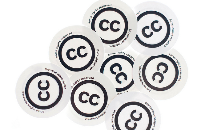
Let’s say you’ve got a blog or a news website and you want a free image for your article or post. You could just go to Google Images and copy the first one you see but you could well be infringing on someone’s copyright. This isn’t just unfair to the photographer or graphic designer, it could also end up being expensive for you if they demand damages. A legal alternative is to look for images with a Creative Commons (CC) license, which allows you to use the pictures under certain conditions. onMedia’s Kyle James, who’s a CC fan, goes into the details.
![]() read more
read more
![]()
35 million images now free for sharing
Getty Images has made a big part of its photo collection free for embedding in non-commercial blogs and sharing via social media.
It’s a very bold move for one the world’s biggest photo agencies, and for an industry that is highly protective of copyright.
Getty says the Internet makes it easy for its images to be used without permission or with proper attribution when people right-click and save a photo from a website or grab a screen shot.
By removing their watermark and making images free for non-commerical use, the photo agency says its images will appear in a custom “Embedded Viewer”: think of YouTube’s embedded player. This “Embedded Viewer” includes the proper copyright information, and when you click on the image, it takes users back to the licensing page on Getty’s website.
![]() read more
read more
![]()
Why you should use graphs or charts in stories
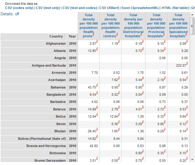
Screenshot of WHO health infrastructure statistics
We are big fans of visualizing data and we’ve produced several blog posts exploring trends in data journalism and useful tools such as datawrapper and infogr.am that can help you get started.
But sometimes, in all the hype around investigating huge sets of data, we might forget that visualizing even small amounts of information can be great for your stories.
Crunching numbers and interpreting statistics are a part of the daily grind of journalism. They help us back up a statement or prove something. They also show trends. However, numbers are often confusing or the concepts behind them are difficult to understand, especially when they are written out in a text. This is where graphs or charts can help. This post will give you some quick examples to demonstrate how simple graphs, charts or iconographs can make numbers easier to understand or more interesting for your readers. Then hopefully, you’ll be inspired to create your own!
![]() read more
read more
![]()
Tools and Apps for Journalists: Infogr.am
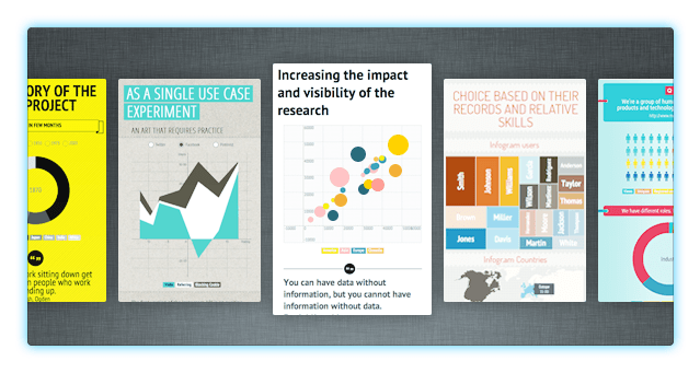
Data visualization has exploded in popularity over the past few years with an ever increasing number of media outlets using visuals as a way of making numbers more interesting and easier to understand.
A corresponding boom in data visualization software has meant it is also becoming incredibly easy to tell stories with data. While there are many sophisticated tools out there, we’re going to introduce you to a free, web-based tool that is a complete cinch for non-designers to use – infogr.am.
![]() read more
read more
![]()


Feedback