


Why you should use graphs or charts in stories
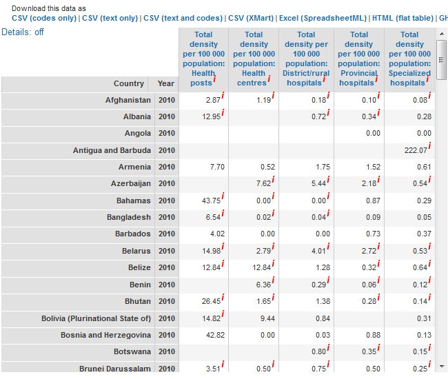
Screenshot of WHO health infrastructure statistics
We are big fans of visualizing data and we’ve produced several blog posts exploring trends in data journalism and useful tools such as datawrapper and infogr.am that can help you get started.
But sometimes, in all the hype around investigating huge sets of data, we might forget that visualizing even small amounts of information can be great for your stories.
Crunching numbers and interpreting statistics are a part of the daily grind of journalism. They help us back up a statement or prove something. They also show trends. However, numbers are often confusing or the concepts behind them are difficult to understand, especially when they are written out in a text. This is where graphs or charts can help. This post will give you some quick examples to demonstrate how simple graphs, charts or iconographs can make numbers easier to understand or more interesting for your readers. Then hopefully, you’ll be inspired to create your own!
Show us, don’t tell us – power use in India
What do you think of the following two sentences?
“India’s power use is currently 210 gigawatts per year. This is expected to increase by 36 percent by 2017 and by a further 25 percent in 2022.”
Like me, you probably think that they are pretty confusing and dull to read (aside from the fact that they don’t tell us what the actual power use is going to be in 2020). Instead of telling readers about the growth of India’s power production, it would be much better to show them by creating a graph. Note though, that a chart usually needs some text to provide context or a brief explanation. I produced this example quickly in datawrapper.
You could also use an iconograph to make the graph stand out – here’s the same information presented in a different way. And you can still use an introductory text, something like:
“India is the fifth largest generator of electricity in the world. At present, two thirds of its power is produced by coal-driven power plants. And it’s not going to get better.”
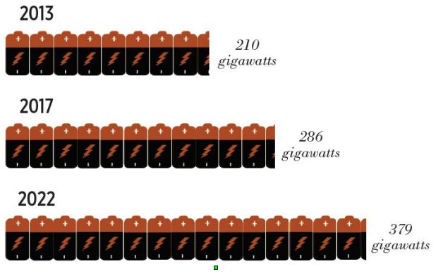
Source: Urbanemissions.info
Give a clear overview of the issue – flow of money sent by migrants from South Africa
A colleague in Malawi was recently writing an article about how much money migrant workers sent home from South Africa as remittances. Although he picked out some statistics to put into his article, he wanted to show the amount sent to each country. He only had a couple of minutes before deadline so we quickly made this chart.
The data, however, also tells another story. It also shows how the majority of remittances are sent to Zimbabwe (in fact 60 percent of the total amount) compared to the other countries.
Depending what angle you are taking in your text, you could also chose to highight this fact. I used infogr.am to make this, literally, in two minutes.
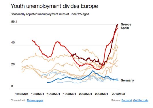
Highlight the differences – unemployment rates in Europe
In his tutorial on how to use Datawrapper, Gregor Aisch created a graph of youth unemployment statistics over the past two decades in Europe. In his example graph, he highlighted in red countries with high unemployment (Spain & Greece) and those with low unemployment such as Germany in blue. The graph really illustrates the difference between the countries far better than a wordy description.
As you can see, data visualization doesn’t have to be about making amazing graphics with huge amounts of data. You can use tools available on the Internet or even in Excel, Office Open Calc or Google spreadsheets to create simple graphics and help you to tell a better story.
Author: Kate Hairsine


![]()
Feedback