


Search Results for Tag: graphs
Why you should use graphs or charts in stories
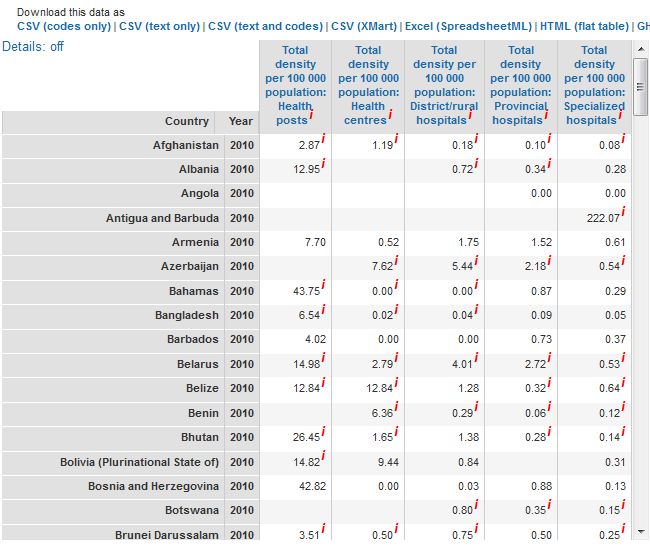
Screenshot of WHO health infrastructure statistics
We are big fans of visualizing data and we’ve produced several blog posts exploring trends in data journalism and useful tools such as datawrapper and infogr.am that can help you get started.
But sometimes, in all the hype around investigating huge sets of data, we might forget that visualizing even small amounts of information can be great for your stories.
Crunching numbers and interpreting statistics are a part of the daily grind of journalism. They help us back up a statement or prove something. They also show trends. However, numbers are often confusing or the concepts behind them are difficult to understand, especially when they are written out in a text. This is where graphs or charts can help. This post will give you some quick examples to demonstrate how simple graphs, charts or iconographs can make numbers easier to understand or more interesting for your readers. Then hopefully, you’ll be inspired to create your own!
![]() read more
read more


![]()
Feedback