


Datawrapper: Making data-driven journalism fast and easy
 Journalists use statistics on a nearly daily basis, but visualizing data is a different story. With a boom in tools and apps to generate infographics and more, this could be changing. One such tool is Datawrapper, developed by Deutsche Welle New Media staffer Mirko Lorenz. “It’s a tool for getting started with data-driven journalism,” Lorenz said. He came up with the idea, and developed it with two programmers. “We didn’t just want to make showy charts, it’s really about the right diagram for the data at hand,” Lorenz said.
Editing desks around the world have been experimenting with the tool, including the Guardian data blog, Le Monde, a Dortmund regional newspaper – and of course, the Deutsche Welle. Datawrapper is open-source, and can be freely downloaded – it’s available in English, German and French.
In an interview with DW Akademie, Lorenz clarified what he thinks the “right” portrayal of data is all about, and explained the advantages of Datawrapper for journalists.
How did you come up with the idea to develop Datawrapper?
Datawrapper is a tool for getting started with data journalism. It offers journalists a very simple way to create the right diagrams during their hectic workdays. We looked at a lot of different tools beforehand. Many Eyes by IBM, for example, had a very interesting idea, but unfortunately the project wasn’t further developed.
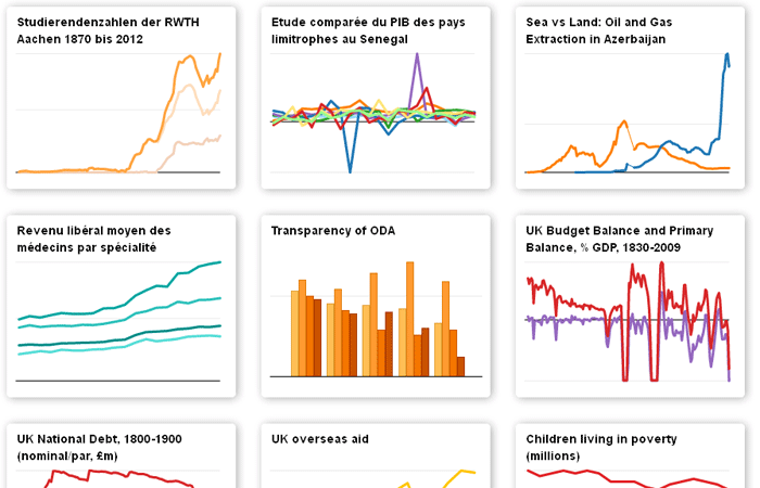
With other offerings, like visual.ly, I cast a critical eye. Data are presented with many different effects, but this can actually decrease the graphical impact. We wanted to set ourselves apart from such projects. So at the beginning of November, we introduced a new version of Datawrapper that offers a limited – but very professional – selection of diagrams.
You’ve mentioned the “right” kind of diagrams. What does that mean, exactly?
Unfortunately, you can always find plenty of bad examples when it comes to displaying data in journalism. It’s often the case that the article is first written, and then a graphic is sought to accompany it. In that case, diagrams aren’t much more than ornamentation, which doesn’t fulfill their potential. The message is easily misunderstood, and – often enough – incorrect.
Used correctly, illustrations clarify an issue – but they can also misrepresent it. Let’s take the simple example of a line graph. If the time axis is stretched, it could show a small increase, in a market for example, as a boom. Or, with a bar graph, leaving off the zero line makes for very different conclusions than by including it.
Simply put, there are rules for good visualizations, which journalists should know and observe. The best book addressing the topic is The Wall Street Journal Guide to Information Graphics by Donna M. Wong. One typical mistake is to split a pie chart into too many pieces – there should never be more than five. But it’s easy to find examples with more than 20. That’s why visualizing specialists always make jokes about pie charts. Datawrapper is designed to prevent such problems, while supporting the user.
You can observe these rules while using other data visualization tools, so what makes Datawrapper special?
 That could be the case, but with a lot of effort, I’d say. Journalists shouldn’t be spending hours correcting colors and lines. Datawrapper is made especially for newsrooms – it was supported by a journalism training organization affiliated with the German Association of Newspaper Publishers. That’s why it’s free. The online version can be used within a news site’s own layout, or installed separately on a server. In principle, an entire data editing desk could be built around the tool, which is something we want to support.
We want to strengthen other media branding, not our own. For example, we think the Datawrapper logo should come off the results if the tool is used intensively. We wanted to give journalists who work with numbers the opportunity to explain things a little better to the rest of the world.
Media outlets can’t do that with other tools like Google or visual.ly. With those tools, the data flows to a cloud that the media organizations don’t own. Especially in the case of investigative reporting, clearly one would have reservations about sharing data with a third party. Aside from all this, Datawrapper is easily customizable.
What kind of graphics can be generated?
Right now, there are four basic options: bar, column, line and pie charts. With the so-called donut chart, one can display the total in the middle of a pie chart. In order to generate the charts, all that needs to be done is create and upload a data table to Datawrapper. The embed code does the rest.
What’s the next step?
The coding side is being further developed, mostly by Gregor Aisch. He’s created a cartographic library, in hopes of making news desks a bit less dependent on Google Maps.
As a later step, we want to develop more complex charts, which are also more visually pleasing. For example, tree maps where one can portray state budgets.
UPDATE: The Africa News Innovation Challenge has just announced Datawrapper as one of the winners in the 2012 round of funding and technical support. Congratulations Mirko and Datawrapper!
“Twenty digital journalism projects have earned $1 million in funding and technical support as part of the African News Innovation Challenge (ANIC).
ANIC is the largest fund for digital journalism experimentation in Africa, and is designed to spur solutions to the business, distribution and workplace challenges that face the media industry.
A jury of 15 international media strategists, technology innovators, and funding experts evaluated more than 500 project plans before selecting winners from a shortlist of 40 projects.”
Interview: Steffen Leidel
Translation: Sonya Angelica Diehn


![]()
Feedback