


Search Results for Tag: graphics
How to plan your multimedia story
(photo: Kyle James)
An online multimedia story is a combination of video, text, photos, audio, graphics and interactive elements where each aspect complements the others. It allows a reporter to draw on the strength of each medium to tell a more compelling story.
But making a multimedia story really shine requires forethought and planning. Even before going out to report, journalists need to think about how they’re going to approach the story, when they’re going to use video, text, sound or photos, and then tie everything together to create a cohesive package. onMedia’s Kyle James has tips on doing the prep work to make sure your multimedia story is a success.
![]() read more
read more


![]()
Using graphics in your video, and using them well
Photo: flickr/gywst
Infographics can enhance a visual story’s appeal and are extremely helpful in presenting complex information in an easy-to-understand way. Now, it’s easier than ever to use graphics in your videos thanks to more advanced and user-friendly software. OnMedia’s Kyle James takes a look at how a production team from Indonesia used graphics effectively in their award winning video feature.
![]() read more
read more
![]()
Social science discovers data-driven journalism
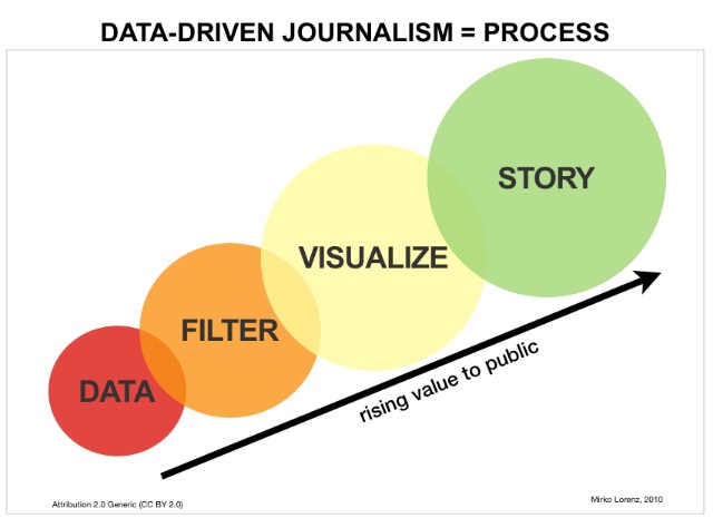 The social sciences can profit from data-driven journalism and vice-versa. Staff at the University of Zurich’s Institute of Political Science are so convinced of this that they’ll begin offering a major in data-driven journalism as part of their Master’s program starting in September 2013. The Institute’s head, Professor Fabrizio Gilardi, believes that the data-driven journalism course won’t just better qualify students for a career in the media. He also hopes that social scientists will start to utilize the techniques of data-driven journalism to present their research in more appealing ways. DW Akademie spoke to Gilardi about the new course.
![]() read more
read more
![]()
Datawrapper: Making data-driven journalism fast and easy
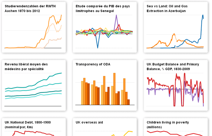 Journalists use statistics on a nearly daily basis, but visualizing data is a different story. With a boom in tools and apps to generate infographics and more, this could be changing. One such tool is Datawrapper, developed by Deutsche Welle New Media staffer Mirko Lorenz. “It’s a tool for getting started with data-driven journalism,” Lorenz said. He came up with the idea, and developed it with two programmers. “We didn’t just want to make showy charts, it’s really about the right diagram for the data at hand,” Lorenz said.
Editing desks around the world have been experimenting with the tool, including the Guardian data blog, Le Monde, a Dortmund regional newspaper – and of course, the Deutsche Welle. Datawrapper is open-source, and can be freely downloaded – it’s available in English, German and French.
In an interview with DW Akademie, Lorenz clarified what he thinks the “right” portrayal of data is all about, and explained the advantages of Datawrapper for journalists.
![]() read more
read more
![]()
Feedback