How to plan your multimedia story
An online multimedia story is a combination of video, text, photos, audio, graphics and interactive elements where each aspect complements the others. It allows a reporter to draw on the strength of each medium to tell a more compelling story.
But making a multimedia story really shine requires forethought and planning. Even before going out to report, journalists need to think about how they’re going to approach the story, when they’re going to use video, text, sound or photos, and then tie everything together to create a cohesive package. onMedia’s Kyle James has tips on doing the prep work to make sure your multimedia story is a success.
Playing to their strengths
Really good multimedia storytelling is more than just posting a video or a graph alongside a text story on a website. It’s about taking advantage of the characteristics of each medium to present the different aspects of your story in the most engaging way.
 I find it’s best to sit down at the very beginning and divide the contents of the story among the different media. I ask myself: “Would this aspect work best as a short video, or should I take pictures or maybe write a couple of paragraphs?”
When I’m breaking things down, here’s what I keep in mind:
Video: Best for action and movement, shows what is happening (a protest, a fire, a person cooking, a dance performance). Can capture emotion well and good for strong quotes (eyewitness to a significant event, person recalling a tragedy). Video really draws people in.
Pictures: Good for capturing a specific, important moment, especially if it’s emotional (a reunion of long-lost siblings, soldier returning from war). Photos are good for showing places, environments and things that don’t move (buildings, landscapes). People can study pictures, unlike with video. That old cliché “a picture is worth a thousand words” still rings true in many instances.
Audio: Conveys emotions, feelings. The voices of experts can give your story credibility. Background (ambient) sound, especially if combined with pictures, can give a good sense of place. Audio works best when combined with pictures or video.
Graphics: These work well providing complex information in easy-to-understand ways. Stories with lots of numbers and statistics can benefit from graphs, showing trends or relationships (clothing exports over the last decade, wage growth). Diagrams can show how things work or how something came about (where floodwaters reached, how the bridge collapsed). Maps show where the story unfolded and can be layered with interactive elements.
Text: The written word works well for abstract, complicated aspects of a story. It’s the place to provide background and analysis, as well as headlines and photo captions. Many multimedia producers save text for the information that can’t be conveyed with video, audio, pictures or graphics.
If we’ve got video of an event, why would we simply describe it with text? Video’s power is showing action, so we should use it. Pictures of people overtaken by powerful emotions or recordings of their voices talking about their experiences are going to be very compelling. Yet an opinion piece on a policy or development or an analysis what has been learned in the wake of an accident might best be suited for text.
Writing it down
Since I can’t keep all this in my head, I need to write things down.
Click here for a planning list that helps you organize your thoughts around a story and how you want to cover it. It asks for things like a working title, a short story synopsis, conflict/tension involved, the main characters, who you’ll interview, and what works best with video/audio/pictures/etc.
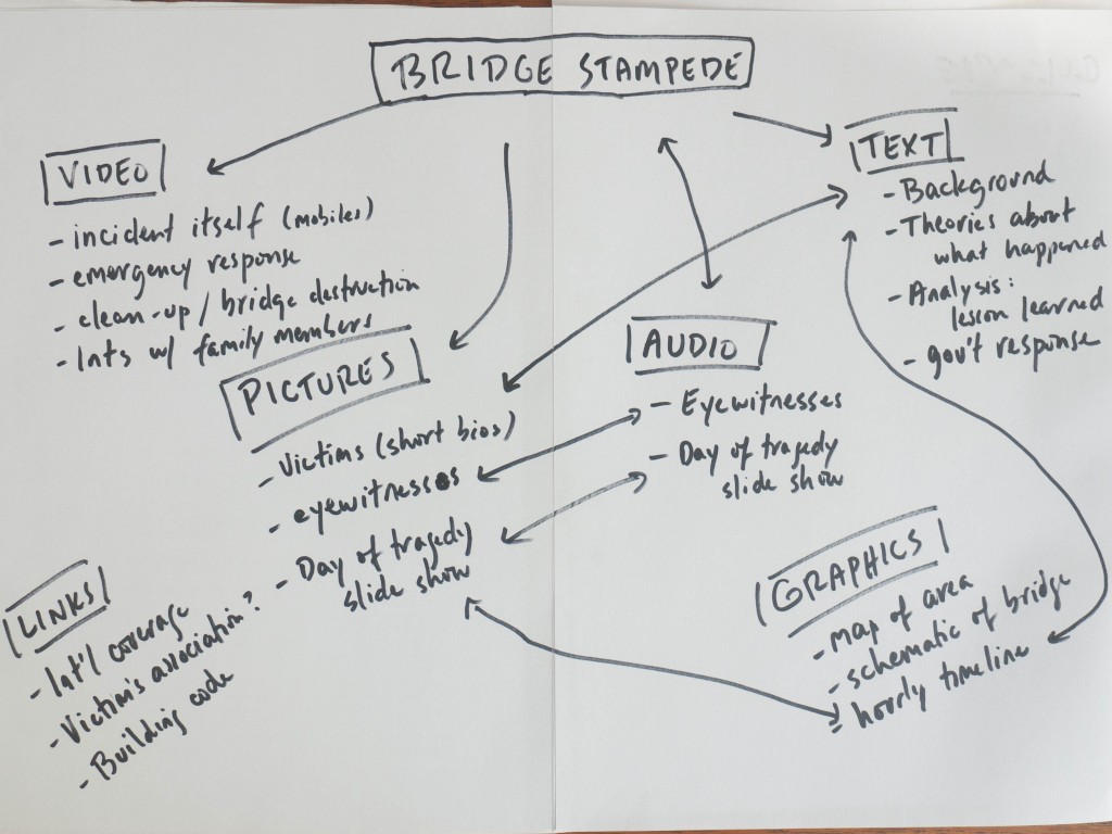
Those who are more visually minded might want to write up a chart instead. The picture below is a quick sketch of possible elements of a multimedia story that I’ll call “The Bridge.” While this isn’t a real multimedia project, the story is true. In 2010, a stampede on a bridge in the Cambodian capital Phnom Penh during a big festival killed 350 people and injured 750 others.
In this instance, I’ve made headers of the main media elements and put in aspects of the story that could fall under each. The arrows between some of them point out aspects of the story could have several elements. For example, the hourly timeline would be an interactive graphic that would incorporate text and pictures.
Assembling a storyboard
Now that you’ve got the elements figured out, you will want to create a rough storyboard of your project. A storyboard is a sketch of how the story will be organized and laid out on the screen. It’s a good idea to do a sketch of the opening page of your multimedia story, the first thing users will see, and then subpages or sections as well.
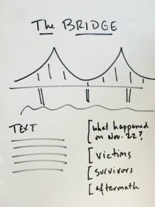 I’ve quickly drawn up mock-ups for the landing page and one inside page.
On the landing page, the first screen people will see on coming to my story, I’ve sketched out (very roughly) the title and the kind of picture I think I’d like.
I’ve put a space for some text to give us the very basics of what happened (remember, text is good for background and context), and then a possible navigation menu with four categories.
I could add a video or more pictures. But right now, I don’t think I want much more on my opening page, so I’m going to keep it simple.
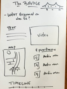 This second page is where users land if they click on the first link in the navigation column, and we go to the background page. I’m using text because it’s good for context, video because we might find some footage of the actual stampede, a map to show users where things happened, a timeline to take us though the day of the tragedy, and eyewitness accounts from people who were there that combine pictures and audio
A storyboard is not only a good organizing tool, it can help point out things you might have missed. It can also help show you if you’ve actually got the resources and time to do all the things you want to do.
Storyboards aren’t written in stone, they’re just guides. You might well start changing things around, or adding and dropping elements, after you begin doing your reporting and seeing what great material you get or what’s not going to come through after all.
Things to keep in mind
- Multimedia stories are multi-dimensional, they use different media elements that complement each other
- They require planning and forethought
- Start thinking in a non-linear way. Instead of “first part” and “second part,” think “this part” and “that part”
- After preliminary research, start thinking about the different media to use – draw on the strengths of each
- Come up with a rough storyboard – you can always change it as you go along
For more onMedia posts on multimedia, see
Visual storytelling and moving beyond ‘multimedia’
A look at what the New York Times is doing with multimedia
The test of the multimedia storytelling app, Stellar
Written by Kyle James, edited by Kate Hairsine


