


Tools and Apps for Journalists: Infogr.am
Data visualization has exploded in popularity over the past few years with an ever increasing number of media outlets using visuals as a way of making numbers more interesting and easier to understand.
A corresponding boom in data visualization software has meant it is also becoming incredibly easy to tell stories with data. While there are many sophisticated tools out there, we’re going to introduce you to a free, web-based tool that is a complete cinch for non-designers to use – infogr.am.
What is Infogr.am?
Infogr.am is an online tool that creates interactive data visualization and infographics. You just enter or upload your data to the site and with a few clicks on your part, the software automatically creates charts or infographics from this data. After you have published your visual to the site, you can then embed your visualization wherever you want to in the same way that you embed a YouTube video. You can also share it on Facebook, Twitter and Pinterest. The best thing is that no programming or design skills are needed – Infogr.am is incredibly simple to use and looks great at the same time.
![]() The Latvian startup was founded in February 2012 by Uldis Leiterts and Raimonds Kaze, both experienced newsroom journalists. The idea behind the tool is to make it quick and easy for journalists and bloggers to make infographics themselves without having to ask the arts department or graphic designers for help. That makes Infogr.am a good useful for online journalists and bloggers in developing countries whose organizations are often run on a shoestring.
The Latvian startup was founded in February 2012 by Uldis Leiterts and Raimonds Kaze, both experienced newsroom journalists. The idea behind the tool is to make it quick and easy for journalists and bloggers to make infographics themselves without having to ask the arts department or graphic designers for help. That makes Infogr.am a good useful for online journalists and bloggers in developing countries whose organizations are often run on a shoestring.
How can journalists use Infogr.am?
Infogr.am allows you to create charts or infographics from any kind of data, from an overview of election results to information about the Formula 1 racing circuit. I recently looked up some statistics about remittances sent by migrant workers from South Africa for a story I was working on. I put these into a simple pictorial chart in Infogr.am and created this visual, literally, within two minutes. You can hover with your mouse over the graph to see the exact figures
You can create more complicated graphics, easily incorporating further charts, texts, pictures, maps and even videos from YouTube and Vimeo. Click here to see how I expanded my original chart in just a few minutes to this (although I could have made it look prettier given more time!).
Infogr.am is also interactive – click here to see, for example, how you can show how a situation has changed over time.
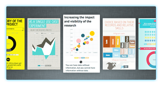
For further inspiration, take a look at the featured infographics on the Infogr.am website.
How can I create a chart or pictograph with Infogr.am?
To start up, you need to create a login (you can also log in with your Facebook or Twitter account). You are then presented with three options – Create, Library or upgrade to pro.
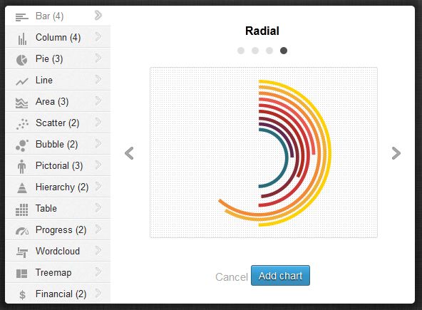
By clicking on Create, you are given a choice of creating an infographic or a chart. There are 30 chart options and six templates for the infographics.
 Once you have decided on what kind of chart you want, you click on it to see the spreadsheet where you enter, copy or upload your data (you can upload XLS, XLSX and CSV files).
Then hey, presto, you have a visual. You can still change the theme later on. You can also play with the chart colors, alter the width and height and add text, sources and other information.
I would like to have more options in the pictograms; the only options for the images are boy, girl, rectangle, circle and star.
Another drawback though is that you have to type your text directly into the infographic. As you can’t copy and paste from another document, it means you have to really have to watch out for typos or spelling mistakes.
A nice function is the library, which stores your graphics published or not so that you can fiddle with them at your leisure.
What else should journalists know about Infogr.am?
Cost: The application is free to use. Infogr.am recently released a pro version that costs US$18 a month and allows you to download the graphics as a pdf or png, share your graphic privately and gives you more design themes.
Publishing: Your graphic is publicly available on the infogr.am page and it is not possible to share the graphic privately with the free version. It is also not possible to download it as a .pdf with the free version.
Excel App: Infogr.am now has a free app that works with Excel 2013 and allows you to create charts directly from your spreadsheet.
Support: Support is available through infogr.am’s Facebook page as well as through the site.
Languages: The site operates in English.
Author: Kate Hairsine


![]()
Feedback