Africa through the eyes of African photographers
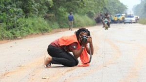 Africa is booming, economically and artistically. And riding on this boom are home-grown African photographers who are capturing alternative images of this rapidly-changing continent. If a picture tells a thousand words, then many photographs taken by Western photographers tell stories of grief and misery. From images of child soldiers brandishing weapons to sickeningly emaciated children, Africa is often portrayed as a continent of war, famine and poverty.
The rise of African photographers, however, is seeing other images emerge of a vibrant continent determined to express itself through its own images. Along with this is increasing recognition of the importance of supporting local photographers. Deutsche Welle, for example, has just awarded a new prize for human rights photography in Africa as part of the German Development Media Awards. One of the few African institutions dedicated solely to photography is the Market Photo Workshop based in Johannesburg. DW Akademie talked to Market Photo Workshop’s head, John Fleetwood, about the importance of photography in Africa, how the scene has changed in the past few decades and some of the challenges African photographers face.
![]() read more
read more
‘Keeping photojournalism useful’
 At the end of last year we interviewed Claudio Palmisano from the 10b agency in Rome and discussed their views on photo editing. See our blog post Digital photo editing and the ethical line between aesthetics and truth.
Along with asking how they work with photographers, we wanted know more about digital photo editing and the line between aesthetics and truth in photojournalism. How far do you edit a photograph without altering its context or meaning?
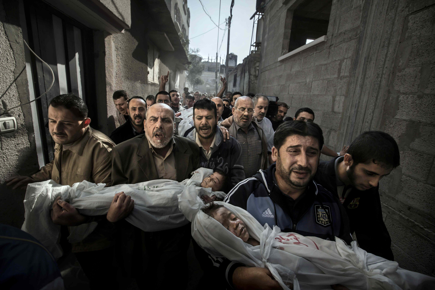
It’s a debate that also surrounded Paul Hansen’s winning photograph in this year’s World Press Photo award.
But given that photography is increasingly delivered and consumed online, how can more information be offered to a publication’s audience to not only enhance understanding of the image, but perhaps see an original and edited image – in the one file?
![]() read more
read more
Tools and Apps for Journalists: TimelineJS
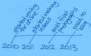 Timelines arrange events in chronological order. From learning about dinosaurs or the order of kings and queens at school, at some stage you would have stumbled over a timeline. The point of a timeline is to make it easier to understand when things happened.
There are plenty of Internet tools to help you create a timeline, but one tool that is popular with media organizations is TimelineJS.
What is TimelineJS?
 TimelineJS (Java Script) lets you easily link to different multimedia sources. So as well as text, you can include videos from YouTube and Vimeo, audio from SoundCloud, photos from Flickr, Tweets, Googlemaps and Wikipedia entries and more. Scribd is also useful for including text documents.
Other media are regularly added so check with the TimelineJS website to see what else they support.
As a result, TimelineJS makes it easy to visually show events and the interactivity means users can explore further if they want to.
![]() read more
read more
Voting open for African human rights photography award
Africa it’s time to cast your vote.
Our colleagues at the German Development Media Awards were delighted that 119 professional photographers from 22 countries submitted entries to the People’s Choice Award documenting human rights in Africa.
The finalists have been selected. Together the photographs in the competition give an insightful look at a range of human rights issues on the continent from freedom of speech to child labour and gender equality.
Voting is simple – just log on to the finalists gallery and vote.
You may cast a single vote for as many photographs as you like.
The winner of the photography award will receive 2,000 euros in prize money and will also be invited to attend the awards ceremony in Berlin on August 14, 2013.
Digital detectives fight photo manipulations
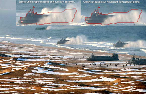
Ever since photography was first invented in the 1800’s, people have been doctoring images. From the army exaggerating military victories to dictators removing political figures who have fallen out of favor, photo manipulation has a long history. To give a recent example, North Korea released a photo of a military exercise showing hovercraft landing on a beach. But the eagle eyes of Alan Taylor from The Atlantic detected that several of the hovercraft were surprisingly similar to each other. It seems somebody with a penchant for copy and paste button had increased the size of the fleet.
It isn’t the first case of visual armament and it won’t be the last. Especially as manipulating photos has never been so easy. Although many doctored images may look clumsy like the hovercraft photo, there are countless image editing tools and apps out there that allow even amateurs to create changes which are almost undetectable to the eye. This is a huge problem for media organizations who are increasingly using images on social networks in their news reporting. And it seems even professional photojournalists can’t be relied on to resist the temptation to pimp their photos with Photoshop.
But how can media outlets ensure that a photo isn’t a fake? This is where computer specialists like Hany Farid come into play. Farid is a professor at Dartmouth College in the US, and a digital forensic scientist who advises media organizations and intelligence agencies on a photo’s authenticity. Farid is also involved in the Silicon Valley company, Fourandsix Technologies, which has released software that can check whether a photo has already been processed in some way. This is an incredibly challenging feat of computing that evaluates numerous parameters. In an interview with DW Akademie’s Steffen Leidel, Farid says even with such software, there will never be 100 percent protection against fake photos.
![]() read more
read more
Digital photo editing and the ethical line between aesthetics and truth?
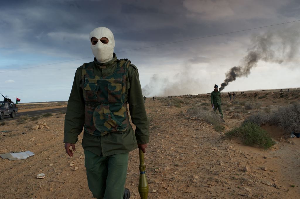
Which do you prefer? The original image of a white balaclava-clad rebel in Libya carrying a rocket propelled grenade, or the more dramatic looking battlefield with increased contrast that brings out richer greys and red hues in the clouds, smoke and earth?
The spectrum of digital tools available to photographers to edit images is vast – from professional software such as Photoshop or Aperture right through to consumer tools such as iPhoto or PicMonkey, not to mention hundreds of mobile photography applications.
If you’re of a certain vintage, then you might be a bit nostalgic about the days of film, the whiff of fixer and the time spent honing your skills in a dark room. Today adjusting the fundamental elements of a digital photograph, its DNA if you like, such as exposure/brightness, colour/saturation, whites/blacks, contrast/shadows and much, much more, are as easy as moving a virtual “slider” with a mouse.
But having a palette of digital tools does not mean editing a photo is a piece of cake. Far from it. In fact for photographers and newsroom photo-editors it opens up a raft of ethical questions.
![]() read more
read more
Documenting life in Zimbabwe
Sweep aside the heavy curtains at the entrance of the Chapelle d’École des Beaux-Arts in Paris and you will be confronted by photographs documenting the decline of Zimbabwe under the rule of Robert Mugabe, and the lives of people suffering on so many levels.
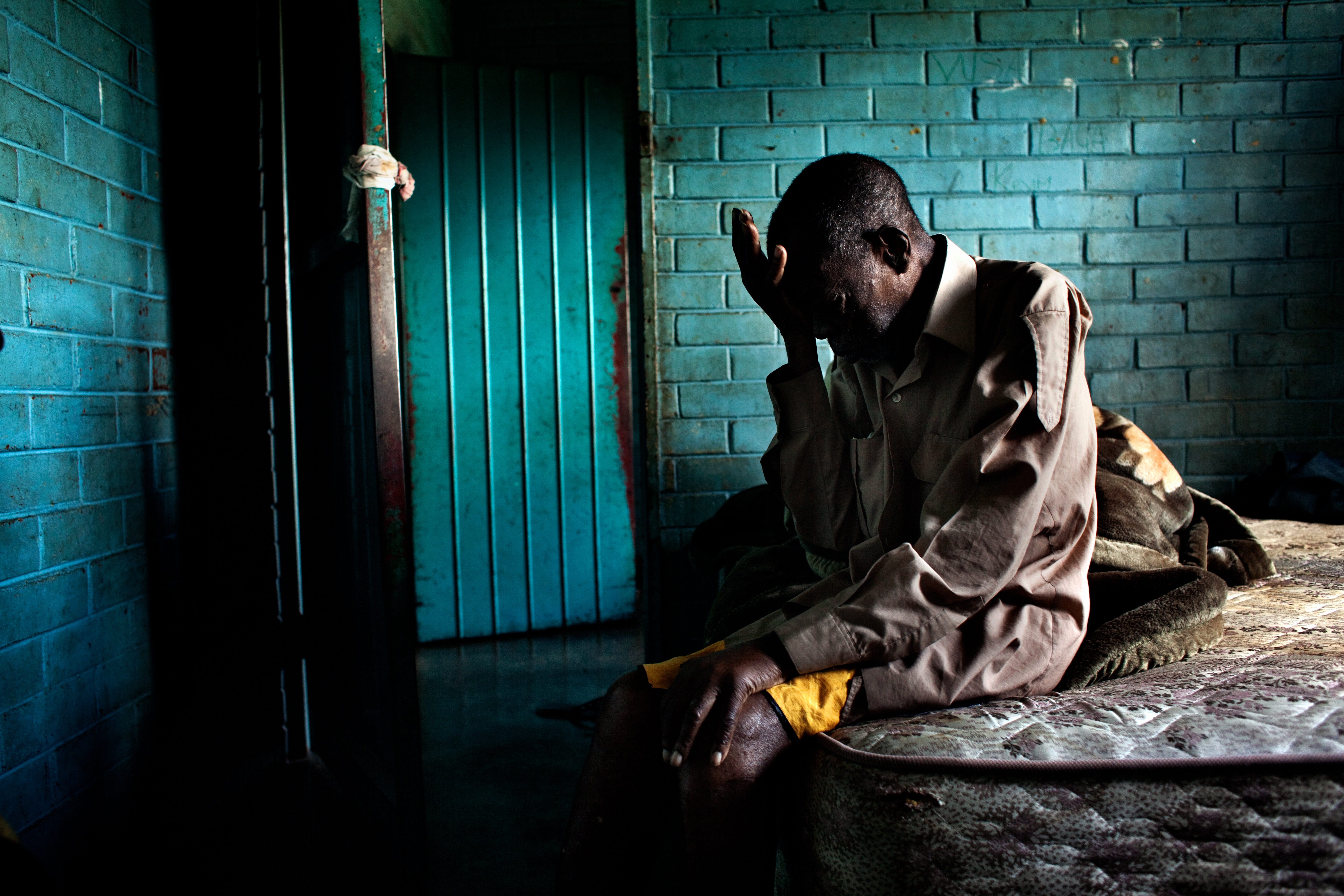
Bedridden by illness, 76 year old Nyatwa relies on his 22 year old grand-daughter to care for him. Robin Hammond, Panos, Carmignac Gestion Photojournalism Award
![]() read more
read more
How to correct shifting lines in photographs
If you take photographs, you’ve probably encountered this situation: You’re trying to photograph a building or a group of buildings, but you can’t move back any further. So in order to get the whole structure into the picture, you use a wide angle. In the resulting frame, the houses look like they’re about to fall over. This phenomenon is caused by a distortion of perspective brought about by the wide angle lens, the so-called shifting or converging lines. In many cases, a free software called ShiftN can help. It automatically corrects shifting vertical lines and turns them into straight verticals.
The video below shows you what this software can do.
This is how the programmers describe this free software: “ShiftN permits correction of converging lines; a majority of the correction work is taken over automatically by the program. Using the ‘automatic correction’ item in the menu is in most cases sufficient to produce a satisfying result. Both the effects of converging lines and poor camera angle are corrected automatically.”
It works, but it doesn’t work wonders
If you use ShiftN to correct converging lines, be careful not to overdo it.  Seeing only straight verticals instead of shifting lines doesn’t look natural. Your photos will seem awkward and unnatural.
ShiftN is great if the distortion is only minor, as seen in the example video. But a case like those white high rises you see at the top of this page is too much for ShiftN’s automatic correction.
As you see on the right, the way ShiftN “corrected” this picture looks artificial. The manipulation is obvious and makes the viewer uncomfortable.
In some cases, you’ve just got to take another step back to get the perfect picture – or be prepared to live with converging lines.
By Thorsten Karg
Data Visualisation and Information Graphics: “Functional like a hammer”
 The visualisation of information is one of the hot topics on the internet at the moment. These days there are more and more tools available which allow anyone to produce information graphics. The graphics that people are sending around via social network sites are often colourful, with big letters and fun icons – but they normally don’t convey much information.
So, what do good information graphics and data visualisations have in common?
Alberto Cairo has been interested in this issue for more than 15 years. He’s a big name in the international scene of graphic designers involved in information communication. In September his book “The Functional Art – an introduction to Information Graphics and Visualization“ is due to hit stores. As part of the project, Cairo interviewed a number of big names from the industry and he explains in detail the important aspects of professional information graphics.
“They should be functional like hammers, multi-layered as onions, and beautiful and true as equations or efficient scientific theories,” he says. In a number of chapters of his book he describes the basics of perception and cognitive psychology, which every graphic designer and journalist should know.
![]() read more
read more
Edit photos online with PicMonkey
 When Google closed its popular Picnik online photo editing service earlier this year, there must have been a collective internet cry of “No!”. For journalist trainees Picnik was a great way of introducing the basics of photo editing, and it was available in several languages. So, what can fill the gap? Enter PicMonkey. Oh and by the way, it’s easy to use and it’s free.
![]() read more
read more





Feedback