


Data Visualisation and Information Graphics: “Functional like a hammer”
 The visualisation of information is one of the hot topics on the internet at the moment. These days there are more and more tools available which allow anyone to produce information graphics. The graphics that people are sending around via social network sites are often colourful, with big letters and fun icons – but they normally don’t convey much information.
So, what do good information graphics and data visualisations have in common?
Alberto Cairo has been interested in this issue for more than 15 years. He’s a big name in the international scene of graphic designers involved in information communication. In September his book “The Functional Art – an introduction to Information Graphics and Visualization“ is due to hit stores. As part of the project, Cairo interviewed a number of big names from the industry and he explains in detail the important aspects of professional information graphics.
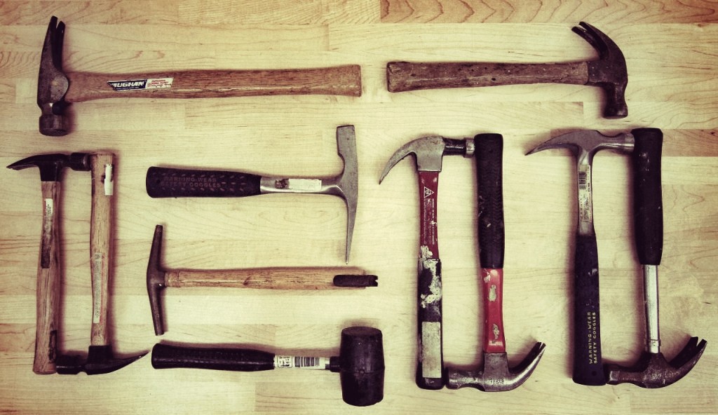
“They should be functional like hammers, multi-layered as onions, and beautiful and true as equations or efficient scientific theories,” he says. In a number of chapters of his book he describes the basics of perception and cognitive psychology, which every graphic designer and journalist should know.
The internet is full of information graphics. For a while now they haven’t just been coming from established media channels – but also from other places too, because people are able to produce them using simple tools. Where does this hunger for visualisation come from?
A number of factors are in play here. In the last few years the number and variety of tools, which you can use to produce information graphics has risen dramatically. The tools are cheaper and easier to use, even for the general public. There are things like Google Charts, Many Eyes and other tools, with which you can simply and fully-automatically produce graphics. Also, these days, the access to data is very different to earlier. When I started working as a visual journalist 15 years ago, it was much more complicated to collect data. Many laws have created more transparency, meaning many democratic nations have been putting their statistics onto the internet. The third point is that the quantity of data these days makes it necessary to use tools which make it easier for us to understand. The human brain and eye simply have too many problems getting clear messages from numeric tables. In contrast, when we portray numbers visually, then we can interpret trends and patterns very quickly.
We are naturally very visual beings. In your book you devote three chapters to cognitive psychology, which looks at the question of how we perceive things. How important are these findings for information graphic designers and journalists?
There are a number of findings from this area of psychology that can help us in our daily work. Why and how do we read something, why do certain graphics function, while others do not? Why do we notice some colours more than others? If you want to establish a hierarchy in a graphic then you have to use different colours. You can’t use strong colours for all elements of the graphic illustration, rather you have to limit them to the sections that you want to stand out. You could use a strong red, which will get our interest. For the secondary elements you should use either grey or pastel colours. Cognitive psychology can help you in your choice of colours.
Should journalists learn about cognitive psychology in their training?
I think so. The findings of psychologists aren’t just interesting for visual communication, they are also relevant to text as well. I recommend a book by a French cognitive scientist, Stanislas Dehaene, called “Reading in the Brain”. He explains how the brain processes text information and he helps us also understand why some typography is easier to read than others.
Many would say when judging info graphics, it is often simply a matter of taste as to whether something is good or not.
That’s not the case. There are things that are based on the structure and the functionality of the brain and the eye. A very simple example that I’ve used many times: When you are making an information graphic to accurately compare numbers, a bar graph or a dot plot are simply better than a bubble chart. Our brain has difficulties comparing the size of various circles. It can discriminate much better between long and short. That’s not a question of taste.
 A real flood of info graphics are being distributed these days via Twitter and Facebook. How do you pick the good from the bad?
The work of the New York Times, the Guardian and the Washington Post is very good. There are also very good freelancers like Moritz Stefaner or Jan Willem Tulp. In Germany I think the work of Gregor Aisch is very good (more examples in Alberto Cairo’s blog). On the internet there are also many info graphics that don’t work, because they ignore a basic rule. The first thing that you always need to ask yourself is: What am I trying to achieve with this visualisation? That’s why I called my book “The Functional Art”. Info graphics is not simply art, it is an art that should help us to better understand information and to analyse. Aesthetics are important but at first you have to develop a visual structure that the brain easily understands. This simple rule has major consequences. The form is dictated by the function and not the other way round. I always say, an information graphic is like a hammer. It’s form has a function. Of course this form can vary, but the basic structure is always the same. It’s not just about creating something beautiful or aesthetic. It is about the structure, the aesthetics are sometimes just a by-product.
Can you name us a few good examples?
For me the New York Times is, at the moment, the number one reference point worldwide for information graphics. Their quality standards are very high. The department responsible consists of 30 people. That is not just a lot of people, they are also some of the best in the business. There are cartographers, statisticians, graphic designers, programmers and journalists. For example I like the weekly column Metrics in the New York Times, which links text and info graphics. I already mentioned Moritz Stefaner. His work is extraordinary, because it is artistic and aesthetic and, at the same time, functional. He thinks like an artist, but is also as a scientist. He studied cognitive psychology and he knows a lot about statistics. Another good reference is National Geographic. What is particularly noticeable in their work is how accurate they try to be in their graphics. By way of example: in the Illustration des Göbekli Tepe in Turkey the colour of the grass and the wood is true to the original. They worked with scientists on that. All the small details are just right.
In order to create such complex info graphics you really need to be very knowledgeable. Do journalists need a new job description now?
Yes, that’s obvious. In his blog “visualisingdata” Andy Kirk wrote a very interesting post: The 8 hats of data visualisation design. He spoke there of eight different types of people, that are needed in an info graphic department in order to produce good visualisations. If the department only consists of three to four people then, logically, some people have to wear more than one hat. Yes, we need new job profiles. It’s all about being better equipped conceptually and technically. Ten years ago no-one thought that programmers were needed in an editorial team. These days programmers and hackers have to be part of an editorial department.
We already mentioned that there are more and more tools available that allow you to make info graphics easily. What are they like?
Every tool can be used for good or for evil. For instance, Excel is still a program that I use every day but the charts created with the default settings in Excel are terrible. It’s all about not being dictated to by just one tool, it should be the other way round. Before you use it, you need conceptual knowledge. If you have that, then every decently-made program can be useful, whether it is Photoshop or visual.ly. In the marketing and PR sector there is often a lack of this conceptual knowledge. Many graphics that are being used at the moment are just presenting numbers without putting the numbers into context. They are too superficial. Just presenting a few numbers, garnished with some nice illustrations, is not enough for a good info graphic.
Interview: Steffen Leidel
Alberto Cairo began his career in Galicia, Spain at the regional newspaper Voz de Galicia. Soon, he was in charge of the graphics department at El Mundo in Madrid, one of Spain’s biggest daily newspapers. During this time he won a number of international prizes with his team (including Malofiej and Society for News Design (SND). After that Cairo was in charge of Multimedia and Infographics at Editora Globo, the magazine department of the biggest media group in Brazil. Cairo combines his practical experience with an academic background. He has lectured at the School of Journalism at the University of North Carolina-Chapel Hill and has been teaching at the School of Communication at the University of Miami since January 2012. He regularly writes articles for the Spanish daily El País on the Future of Journalism.
Links to cognitive psychology and the perception of graphics:
Colin Ware: Information Visualization
Stephen Kosslyn: Graph Design for the Eye and Mind
M. MacEachren: How Maps Work: Representation, Visualization, and Design


![]()
Feedback