


Search Results for Tag: data journalism
Checking the facts in Africa
![]() The idea of Africa Check is straightforward. Investigate claims made in public; check the facts; and, publish the findings.
The idea of Africa Check is straightforward. Investigate claims made in public; check the facts; and, publish the findings.
Africa Check was launched in 2012, and is a non-profit organisation led by the media development agency AFP Foundation and the Journalism Department of the University of the Witwatersrand in Johannesburg.
The organisation not only examines the public claims of politicians, leaders in civil society, government agencies and NGOs, but also checks the facts journalists use in their stories.
Peter Cunliffe-Jones of the AFP Foundation is the Director of Africa Check and says getting the facts right is the “essence” of journalism. But under the pressure to feed 24 hour news, and working across more topics, journalist may feel they “don’t have the time and the expertise, or even know where to look” to verify information.
Reading an Africa Check report is a little bit like a mini-lesson in the basics of journalism. You also see that this project has the potential to have a high impact on African media and perhaps serve as a model in other countries or regions.
![]() read more
read more


![]()
Data experts help expose offshore leaks
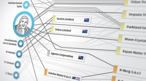 Last year, the International Consortium of Investigative Journalists (ICIJ) in Washington received a huge data set consisting of 2.5 million documents on tax havens from unknown sources. The documents contain 130,000 names of people from 170 countries suspected of fraud, among them oligarchs, arms dealers and criminal financial investors. Apart from that, there were more than two million emails and lists of 122,000 covert companies and trusts from respective tax havens. The unprecedented research that followed brought together media outlets from 46 countries which set themselves to check the data. Here in Germany, the Süddeutsche Zeitung, a leading newspaper, was involved in the process of analyzing the data. In this post editor Bastian Brinkmann writes how data experts helped to analyze the enormous volumes of data.
![]() read more
read more
![]()
Social science discovers data-driven journalism
 The social sciences can profit from data-driven journalism and vice-versa. Staff at the University of Zurich’s Institute of Political Science are so convinced of this that they’ll begin offering a major in data-driven journalism as part of their Master’s program starting in September 2013. The Institute’s head, Professor Fabrizio Gilardi, believes that the data-driven journalism course won’t just better qualify students for a career in the media. He also hopes that social scientists will start to utilize the techniques of data-driven journalism to present their research in more appealing ways. DW Akademie spoke to Gilardi about the new course.
![]() read more
read more
![]()
Datawrapper: Making data-driven journalism fast and easy
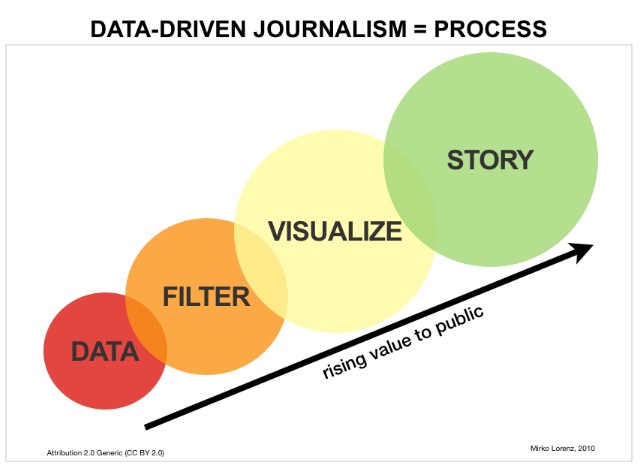
 Journalists use statistics on a nearly daily basis, but visualizing data is a different story. With a boom in tools and apps to generate infographics and more, this could be changing. One such tool is Datawrapper, developed by Deutsche Welle New Media staffer Mirko Lorenz. “It’s a tool for getting started with data-driven journalism,” Lorenz said. He came up with the idea, and developed it with two programmers. “We didn’t just want to make showy charts, it’s really about the right diagram for the data at hand,” Lorenz said.
Editing desks around the world have been experimenting with the tool, including the Guardian data blog, Le Monde, a Dortmund regional newspaper – and of course, the Deutsche Welle. Datawrapper is open-source, and can be freely downloaded – it’s available in English, German and French.
In an interview with DW Akademie, Lorenz clarified what he thinks the “right” portrayal of data is all about, and explained the advantages of Datawrapper for journalists.
![]() read more
read more
![]()
Data Visualisation and Information Graphics: “Functional like a hammer”
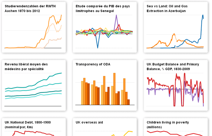
 The visualisation of information is one of the hot topics on the internet at the moment. These days there are more and more tools available which allow anyone to produce information graphics. The graphics that people are sending around via social network sites are often colourful, with big letters and fun icons – but they normally don’t convey much information.
So, what do good information graphics and data visualisations have in common?
Alberto Cairo has been interested in this issue for more than 15 years. He’s a big name in the international scene of graphic designers involved in information communication. In September his book “The Functional Art – an introduction to Information Graphics and Visualization“ is due to hit stores. As part of the project, Cairo interviewed a number of big names from the industry and he explains in detail the important aspects of professional information graphics.
“They should be functional like hammers, multi-layered as onions, and beautiful and true as equations or efficient scientific theories,” he says. In a number of chapters of his book he describes the basics of perception and cognitive psychology, which every graphic designer and journalist should know.
![]() read more
read more
![]()


Feedback